
Get In Touch
Pudgy Squirrel Marketing
What a Roofing Company’s Website Needs to Convert Visitors Into Booked Estimates (With Examples)
By Tony
October 20, 2026
12 mins
Share:
The Problem Most Roofing Websites Have
If you check your Google Analytics (or have someone check it for you), you will probably find the same story that most roofing companies find: a reasonable amount of traffic arriving at the site, and a very small percentage of those visitors actually contacting the company.
The industry average conversion rate for local service websites is somewhere between two and five percent of visitors. That means for every 100 people who visit a typical roofing company’s website, 95 to 98 of them leave without taking any action.
Some of those people were never going to convert: they were on the wrong website, searching for something else, or just doing early-stage research. But a significant portion of them were real potential customers who had a roofing need, found the company, and then could not quickly confirm that the company could help them, was trustworthy, and could be reached easily.
Those are the conversions the website should be capturing and isn’t.
This post covers the specific elements that high-converting roofing websites have in common, with examples of what each element looks like in practice and why it works. If you implement these elements on your existing site, you will convert more of the visitors you are already getting before spending another dollar on traffic.
Element 1: A Phone Number That Is Impossible to Miss
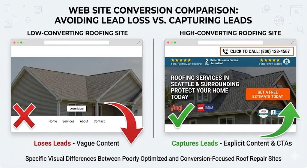
This sounds so obvious that it should not need to be said. It needs to be said because a significant percentage of roofing company websites make the phone number either invisible above the fold, hidden in the footer, or presented as plain text rather than a click-to-call link on mobile.
Why This Matters More Than It Seems
The homeowner who has just discovered your website on their phone is often in one of these situations: they are standing in their backyard looking at a problem, they are at work thinking about a problem they noticed that morning, or they are sitting on the couch scrolling through options after dinner. In all three situations, they want to call, not research.
If calling requires them to scroll to find the number, zoom in to read it, or manually dial it rather than tap it, some percentage of them will not bother. They will go back to the search results and tap the next company.
What a high-converting phone number placement looks like:
- In the top right corner of the desktop header, visible on every page
- As a sticky banner at the top of the mobile site that scrolls with the page
- Formatted as a clickable link on mobile so one tap initiates the call
- Repeated in the body of the homepage, not just the header and footer
The one addition that increases calls: A short piece of context next to the phone number. “Call now free estimates” or “We answer 7 days a week” gives the visitor a reason to call rather than just a number to dial.
Element 2: A Headline That Tells the Visitor They Are in the Right Place
Your website’s homepage headline is the first piece of content most visitors read. It has approximately three seconds to answer the question every visitor is asking when they arrive: “Is this company right for my situation?”
Most roofing company headlines fail this test. “Quality Roofing You Can Trust” and “Your Local Roofing Experts” are the two most common homepage headlines in the industry. Both communicate almost nothing specific.
What a High-Converting Headline Contains
A headline that converts tells the visitor:
- What you do (specifically)
- Where you do it (service area)
- Optionally: what makes you different or better
Examples that convert:
- “Roof Replacement and Repair in [City] and Surrounding Areas Free Estimates”
- “[City]’s Top-Rated Roofing Contractor | Shingles, Metal, and Storm Damage”
- “Trusted Roofing in [City]: Family-Owned, Fully Licensed, 500+ Five-Star Reviews”
Examples that don’t convert:
- “Quality Roofing Solutions”
- “We Take Pride in Our Work”
- “Your Home, Our Commitment”
The difference is specificity. A visitor who sees your city name in the headline immediately knows they are in the right place. A visitor who sees a generic phrase has no more information than they had from the Google search result.
The Subheading Opportunity
Pair the primary headline with a one-sentence subheading that handles anything the headline does not. If the headline names the service area, the subheading can name the services. If the headline names the services, the subheading can name the area. Add any key differentiator (years in business, license number, warranty terms) that builds credibility.
Element 3: Social Proof That Appears Before the Visitor Has to Look for It
Reviews and testimonials work. This is not a marketing opinion; it is documented behavior: homeowners choosing a local contractor without a personal referral treat reviews as the primary proxy for trustworthiness that they do not yet have from personal experience.
The problem is where most roofing websites put their social proof. The reviews section appears at the bottom of the homepage, below multiple paragraphs of service description, after the photo gallery, and before the contact form. Most visitors who bounce within 90 seconds never scroll that far.
Where Social Proof Should Appear
In the header or immediately below the hero section: A five-star rating badge from Google or a simple row of stars with a review count (“Rated 4.9 from 127 Google Reviews”) placed above the fold tells the visitor immediately that this is a well-regarded company before they have read a single word of your content.
In the hero section itself: A pull quote from a specific customer review, not a generic testimonial but a sentence from an actual review that mentions the specific reason they were satisfied, is more persuasive than any marketing copy you can write about yourself.
In the CTA sections: Place a brief review reference near every contact form or call-to-action. “Join 500+ satisfied homeowners in [area]” above the form button gives the visitor a social confirmation signal at exactly the moment they are deciding whether to submit.
What Kind of Social Proof Works Best
Specific is better than general. “Great job, very professional” is less persuasive than “They replaced our roof in one day, cleaned up every nail in the yard, and the estimate matched the final bill exactly.”
Named and located reviews are better than anonymous testimonials. First name and city is enough context to make a review feel like a real person rather than marketing copy.
Volume matters alongside quality. A 4.8 rating from 200 reviews is more persuasive than a 5.0 rating from 11 reviews. Homeowners apply the same statistical intuition to reviews that they apply to other decisions: more data points is more reliable.
Element 4: A Contact Form That Actually Gets Filled Out
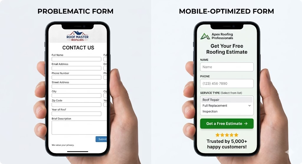
Most roofing company contact forms have too many fields. The impulse to collect as much information as possible is understandable. It is also a conversion killer.
Every field added to a form reduces completion rate. This is documented in conversion research across industries. For a roofing company website, the practical consequence is that a seven-field form converts at half the rate of a three-field form for the same volume of visitors.
The Minimum Viable Form
The minimum information you need to follow up with a lead is:
- Name
- Phone number or email (one or the other, not both as required fields)
That is two fields. Two-field forms convert exceptionally well. The instinct to require email AND phone, to add address, to ask about the service needed: all of these reduce completion rates. You can ask those questions on the follow-up call.
For roofing companies that want a middle ground:
Three to four fields is a reasonable balance: Name, Phone, Service Type (as a dropdown, not a text field), and a brief message field (optional, not required). This collects enough context for a useful initial call without requiring significant effort from the visitor.
The Form’s Position on the Page
A contact form that appears only at the bottom of the homepage is one that many mobile users never encounter. The most effective placement for roofing company contact forms:
- A short inline form in the hero section of the homepage (“Name, Phone, and a button” format)
- A sticky “Get a Free Estimate” button on mobile that opens a simplified form without navigating away
- A repeat form in the middle of the homepage, not just at the top and bottom
- A form on every service page, not only on the contact page
The contact page should have a full form. The homepage should have a simplified version that appears multiple times. Every service page should have at least a brief form or a strong CTA that links to the booking flow.
Element 5: Service Area Clarity
A visitor who cannot quickly confirm that your company serves their location will not become a lead. They will leave to find someone who clearly serves them.
This is especially true for roofing companies with irregular service areas, those that serve multiple counties but not all of them, or companies that have a home base city but do not make their coverage clear.
How to Communicate Service Area Clearly
In the headline: Naming the primary city or region you serve in the homepage headline is the most efficient way to establish service area instantly.
In the navigation or header: A brief line near the navigation that says “Serving [City], [City], and [Region]” establishes area coverage for any visitor who scrolls the header before reading body content.
In a dedicated service area section: A section on the homepage or a standalone service areas page that lists every city, county, and community you serve. This page has SEO value beyond user clarity: it creates the internal link structure that helps your service area pages rank.
Through individualized service area pages: A dedicated landing page for each primary service area you want to rank in. “Roofing Contractor in [City]” as a standalone page is more effective for ranking and converting [City] searches than a homepage that mentions [City] once.
Service area pages are one of the highest-ROI additions any local service website can make, and they are also one of the most systematically neglected. Pudgy Squirrel builds and optimizes local SEO and website structures for roofing companies specifically to address this gap between the cities a company serves and the cities it ranks in.
Element 6: Project Photography That Does the Selling for You
Homeowners making roofing decisions want to see what your work looks like. The portfolio of a roofing company’s website is often the most visited section after the homepage, and it is frequently the section that determines whether a lead moves forward or continues shopping.
What Makes Project Photography Convert
Before-and-after pairs are more persuasive than after-only shots. A beautiful new shingle roof photograph is impressive. The same photograph paired with a before image that shows the deteriorated, algae-streaked, granule-depleted existing roof makes the after even more impressive and tells a story.
Photographs with context convert better than standalone images. A caption that identifies the location (“Cedar shake replacement in [neighborhood], [City]”), the material used, and the project scope turns a photograph into evidence rather than decoration.
Volume matters. A gallery of 40 real project photographs from your recent work communicates more about your volume and consistency than 8 carefully curated hero shots. Homeowners who scroll through a large gallery with varied project types and locations are forming a mental picture of a busy, established company.
Photograph quality needs to be adequate, not professional. A modern smartphone in good lighting produces photographs that are entirely adequate for a contractor website. Blurry, dark, or low-contrast photographs undermine rather than support the presentation. Adequately lit, in-focus photographs of completed work are effective even without professional photography.
Mobile-optimized gallery display. A gallery that works beautifully on desktop but presents as tiny tappable thumbnails on mobile loses most of its impact for the majority of visitors who encounter it on phones.
Element 7: Credentials, Licenses, and Trust Markers
The homeowner who finds your website through search has no prior relationship with your company. They are evaluating whether to trust you with a $12,000 to $25,000 project based on what your website communicates.
Credentials and trust markers are not a section to add at the bottom of the about page. They are signals that should be visible throughout the site in the places where trust matters most: the header, the hero section, near contact forms, and on every service page.
The Trust Markers That Matter Most for Roofers
State contractor license number: Displaying your license number explicitly (not just claiming to be licensed) signals transparency and allows verification-minded homeowners to confirm the claim.
Insurance confirmation: “Fully insured liability and workers’ compensation” displayed explicitly. For homeowners who know to ask about workers’ compensation, seeing it stated proactively is meaningful.
Manufacturer certifications: Certified installer status from shingle manufacturers (GAF Master Elite, Owens Corning Preferred, CertainTeed SELECT) carries real credibility with homeowners who have researched materials.
Years in business: “Serving [City] since [year]” is more credible than “15+ years of experience.”
BBB rating or Angi/HomeAdvisor verification: Third-party verification badges from established platforms add independently confirmed credibility.
Named owner or team: A contractor website with a named owner and a team photograph converts better than one that is entirely anonymous. The human element signals accountability.
Element 8: Mobile Experience That Does Not Frustrate
More than 65 percent of local service searches in most U.S. markets are conducted on mobile devices. A website that was designed for desktop and adapted for mobile is a website that frustrates the majority of its visitors.
The Mobile Experience Tests Every Roofing Website Should Pass
Load speed: Use Google PageSpeed Insights (free) to test your site’s mobile load time. A score below 50 on mobile is a significant conversion problem.
Tap target size: Buttons and links on mobile need to be large enough to tap accurately without zooming. Minimum tap target size is approximately 48 by 48 pixels.
No horizontal scrolling: Every element on a mobile page should fit within the screen width.
Readable font size without zooming: Body text at 16 pixels or larger is readable without zooming on standard mobile screens.
Forms that work on mobile keyboards: Phone number fields should trigger the numeric keyboard. Email fields should trigger the email keyboard.
Element 9: Clear Next Steps That Remove Uncertainty
Many homeowners who would otherwise become leads abandon at the last moment because they are uncertain about what happens after they call or submit a form.
Uncertainty is a conversion killer. The visitor who hesitates at the CTA because they are not sure what happens next is the visitor you lose to a competitor whose site is clearer about the process.
How to Address the “What Happens Next” Question
A brief process description positioned near the primary CTA eliminates this uncertainty:
Example: “Here’s how it works: Call or fill out the form. We’ll call you back within one business day to schedule a free estimate. Our estimator will walk your roof and give you a written quote the same day. No pressure. No commitment until you’re ready.”
This four-sentence description answers the main anxiety questions: Will they respond quickly? What does the estimate involve? Is there pressure?
Other uncertainty-reducing elements:
- “No obligation” or “no commitment required” language near CTAs
- Response time expectations (“We respond within 24 hours” or “We answer 7 days a week”)
- Process infographic showing the three-step estimate and project experience
- FAQ section addressing common hesitations
Putting It All Together: The Priority Implementation Order
Not every roofing company needs to rebuild their website from scratch. Many sites can achieve significantly better conversion by implementing these elements on the existing structure.
The priority order for implementation:
- Add a click-to-call phone number prominently above the fold. This is a 30-minute fix that can immediately increase calls.
- Update the homepage headline to name your service area and primary service. Specific over generic, every time.
- Add a Google review badge and star rating above the fold. Most review platforms provide an embeddable widget that takes an hour to implement.
- Simplify the contact form to three fields or fewer. Removing fields typically increases completions within days.
- Add service area clarity to the header and homepage. Either a dedicated service areas section or individual service area pages for each community you serve.
- Audit mobile experience for the five common failure points. Load speed, tap target size, text size, horizontal scrolling, keyboard optimization.
- Add a “how it works” process description near the primary CTA. Three to four sentences that answer the main anxiety questions.
- Build a legitimate project photo gallery. Before-and-after pairs with context captions, minimum 20 projects.
- Display credentials, license number, and certifications explicitly. Not as claims. As specific, verifiable information.
- Add repeat CTAs and forms throughout the page, not only at top and bottom.
A website that implements all ten of these elements consistently will convert at two to three times the rate of the typical roofing company site.
Pudgy Squirrel designs and builds roofing contractor websites specifically for conversion. The sites are built from the beginning around the elements in this post rather than retrofitting them onto a design that was not built for conversion. If your current site has the traffic but not the leads, the problem is conversion, and conversion is solvable.
The Ongoing Conversion Optimization Process
A website is not a finished product. It is an ongoing system that should be tested, refined, and improved based on what visitor behavior data shows.
At minimum, any roofing company website should track:
- Overall conversion rate (leads divided by sessions)
- Mobile vs. desktop conversion rate (these are often dramatically different)
- Which pages produce the most form submissions
- Which traffic sources convert at the highest rate
This data identifies where the opportunities are. A page with high traffic but low conversion rate is the highest-priority optimization target. A traffic source with a high conversion rate is the channel worth investing more in.
Google Analytics 4 is free and provides all of this data. If your site is not connected to an analytics platform, that connection is the first step before any other optimization. Pudgy Squirrel’s website and SEO services include analytics setup and conversion tracking so that every change made to the site is measurable.
The Bottom Line
A roofing company website that converts poorly is not primarily a traffic problem. It is a conversion problem, and conversion problems are solved by specific, identifiable changes to what the site shows and how it functions.
The nine elements in this post are not design preferences. They are the specific features that determine whether a visitor who lands on your site becomes a lead or becomes someone else’s customer.
Start with the easy wins: a visible phone number, a specific headline, social proof above the fold, and a simplified contact form. These changes can be made to most existing sites quickly and will produce measurable results before you invest in any additional traffic.
Then build toward the full set: service area pages, a project gallery with before-and-after pairs, explicit credentials, a mobile experience that works correctly, and a process description that removes the uncertainty that keeps visitors from contacting you.
The website that has all of this in place is the website that converts the traffic you are already getting and makes every future marketing investment more productive.
Why Schedule a Call?
Popular Insights
How Roofers Get More Leads in the Off-Season: A Practical Marketing Playbook for Slow Months
Oct. 13, 2026
How to Build a Referral Program for Your Roofing or Construction Business (Without Spending a Fortune)
Oct. 09, 2026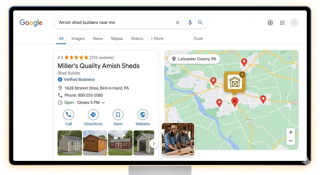
The Amish and Plain Community Business Owner’s Guide to Online Marketing
Oct. 02, 2026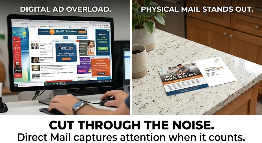
Mailers Aren’t Dead: Why Direct Mail Still Works for Roofing and Construction (And How to Run One That Converts)
Sep. 22, 2026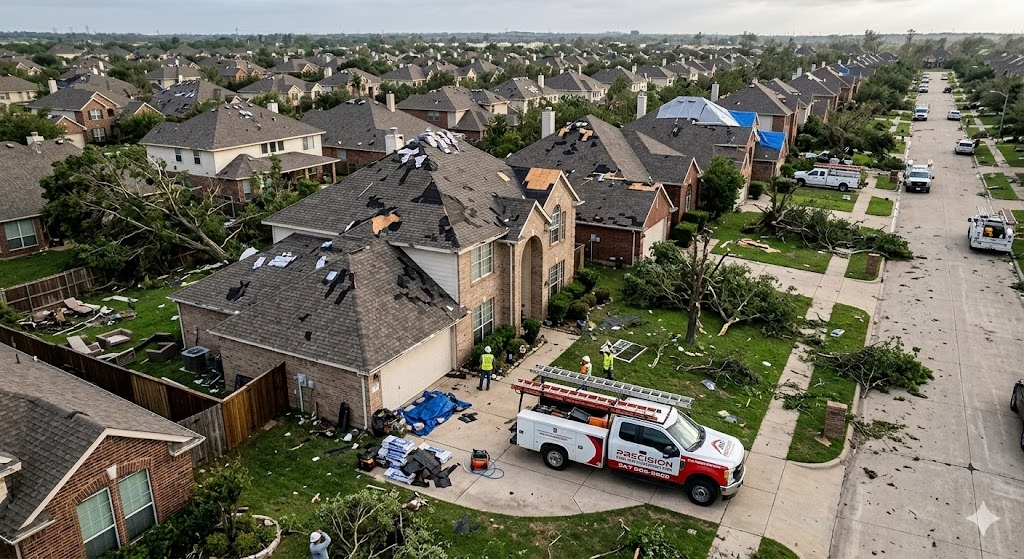
Storm Season is Coming: How to Market Your Roofing Business Before, During, and After a Major Weather Event
Sep. 18, 2026Topics
Pudgy Squirrel Marketing
What a Roofing Company’s Website Needs to Convert Visitors Into Booked Estimates (With Examples)
Read More
Pudgy Squirrel Marketing
How Roofers Get More Leads in the Off-Season: A Practical Marketing Playbook for Slow Months
Read More
Pudgy Squirrel Marketing
How to Build a Referral Program for Your Roofing or Construction Business (Without Spending a Fortune)
Read More
Pudgy Squirrel Marketing
The Amish and Plain Community Business Owner’s Guide to Online Marketing
Read More
Pudgy Squirrel Marketing
Mailers Aren’t Dead: Why Direct Mail Still Works for Roofing and Construction (And How to Run One That Converts)
Read More
Pudgy Squirrel Marketing
Storm Season is Coming: How to Market Your Roofing Business Before, During, and After a Major Weather Event
Read More

Pudgy Squirrel Marketing
Email Marketing for Contractors: The 5 Campaigns That Actually Bring Back Past Customers
Read More
Pudgy Squirrel Marketing
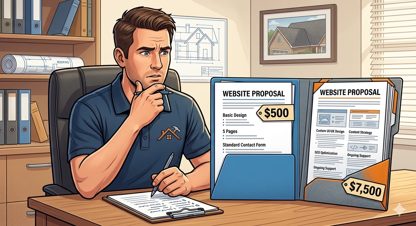
What a Roofing Website Should Cost in 2026 (And What You Actually Get for the Money)
Read More