
Get In Touch
7 Signs Your Construction Company’s Website Is Losing You Jobs (And How to Fix It)
By Tony
June 26, 2026 14 mins
Share this post

Digital Marketing Solutions Tailored for Construction, Roofing, and Shed Businesses
Digital Marketing Solutions Tailored for Construction, Roofing, and Shed Businesses
Digital Marketing Solutions Tailored for Construction, Roofing, and Shed Businesses
Key Takeaways
- A construction company website doesn’t have to be broken to be losing you business. Most of the damage happens quietly slow load times, missing trust signals, and unclear calls-to-action that cause visitors to leave before they ever contact you.
- The average homeowner spends less than 15 seconds deciding whether to stay on a website or hit the back button. Your site either earns that decision or loses it and most contractor sites lose it.
- Mobile usability is not optional. Over 60% of local service searches happen on smartphones, and a website that isn’t optimized for mobile is actively rejecting more than half of its potential customers.
- A website that looks professional but isn’t built to convert is a brochure not a sales tool. The difference comes down to specific structural and content decisions that most construction websites never make.
- Each of the seven problems in this post has a specific, actionable fix none of which require rebuilding your entire website from scratch.
- A website that consistently converts visitors into leads is the single highest-leverage marketing asset a construction company can own. Getting it right amplifies every other marketing dollar you spend.
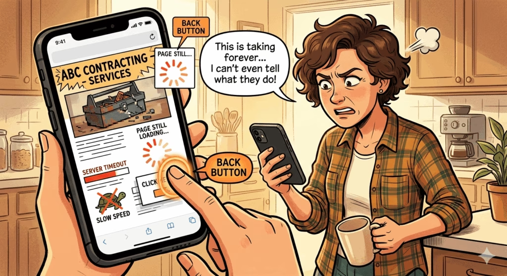
The Website That Looks Fine and Costs You Thousands
Here’s a scenario that plays out constantly in the construction industry.
A homeowner finds your business. Maybe through a Google search, a Facebook post, or a referral from a neighbor. They have real intent they need a roofer, a deck builder, a general contractor and they’ve been told or shown that you might be the one.
They click over to your website.
In the next 15 seconds, something goes wrong. The page loads slowly. The phone number isn’t visible. They can’t tell from the homepage what you actually do or where you work. The last project photo was uploaded three years ago. There’s no clear way to request an estimate.
They hit the back button.
You never knew they were there. That lead which might have become a $12,000 job is gone. It happens dozens of times a month on websites that their owners believe are “fine.”
This post is about the seven specific signs that a construction website is losing jobs silently and exactly what to do about each one.
Sign #1: Your Website Loads Slowly
Why It’s Losing You Jobs
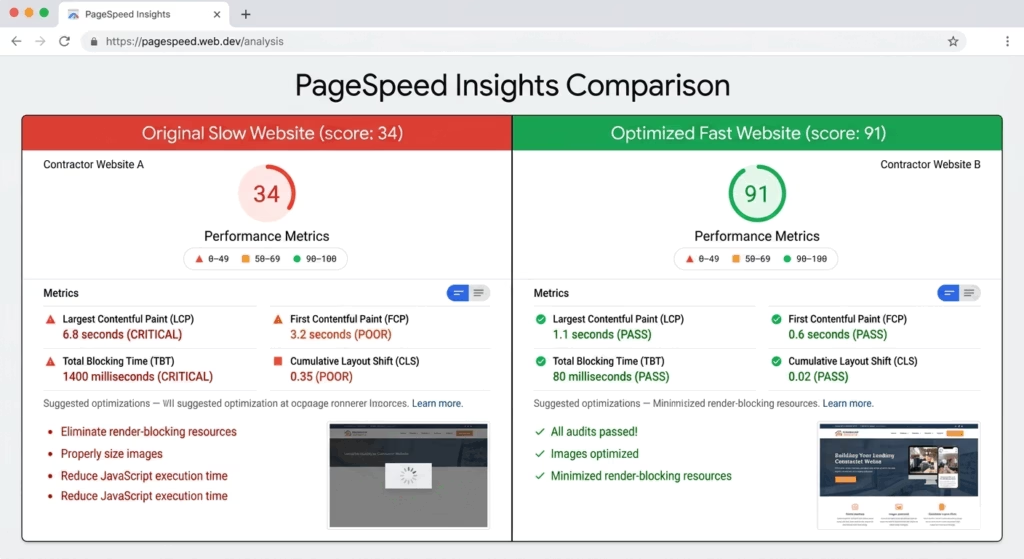
Page speed is not a technical nicety. It’s a direct revenue factor.
Google’s own research found that 53% of mobile users abandon a website if it takes more than three seconds to load. For construction companies where the majority of traffic comes from mobile users in the middle of their day a slow website is functionally turning away more than half of its potential visitors before they ever see a single thing about your business.
Speed also affects your Google rankings. Page Core Web Vitals a set of speed and user experience metrics are a direct ranking factor in Google’s algorithm. A slow website ranks lower in search results, which means fewer visitors to begin with.
How to diagnose it:
Go to PageSpeed Insights and enter your website URL. Google will score your site on both mobile and desktop performance from 0–100, identify specific issues dragging down the score, and tell you what to fix.
A score below 70 on mobile is a significant problem. Below 50 is urgent.
How to Fix It
The most common causes of slow construction websites:
- Uncompressed images: Project photos straight from a camera or modern smartphone are often 5–15MB each. At that size, a gallery of ten photos adds a minute of load time. Compress every image to under 200KB before uploading using a free tool like Squoosh or TinyPNG.
- Slow hosting: Budget web hosting is slow. If your site is hosted on a shared server for $5/month, that hosting decision is actively costing you leads. Upgrading to a faster host (SiteGround, WP Engine, or Kinsta for WordPress sites) is typically $25–$50/month and pays for itself immediately in recovered leads.
- Too many plugins or third-party scripts: Every chat widget, review badge, social media feed, and analytics tool adds code that the browser has to load. Audit and remove any tool that isn’t essential.
- No caching: Caching stores a version of your website that loads faster for returning visitors. Most WordPress sites can add this in minutes with a free plugin like WP Super Cache or W3 Total Cache.
Sign #2: It’s Not Mobile-Friendly
Why It’s Losing You Jobs
More than 60% of local service searches “roofing contractor near me,” “deck builders in [city],” “general contractor near me” happen on smartphones. A potential customer who finds your site through Google Maps or a Facebook post is almost certainly viewing it on their phone.
If your website was built more than four or five years ago without ongoing mobile optimization, it may look fine on a desktop and be nearly unusable on a phone: tiny text, buttons too small to tap, content that runs off the edge of the screen, images that don’t resize correctly.
A mobile user who can’t easily read or navigate your site doesn’t struggle through it. They leave and call your competitor who has a site that works.
Google also uses mobile-first indexing, meaning it evaluates and ranks your website based on its mobile version not its desktop version. A site that’s beautiful on a computer but broken on a phone is ranked based on the broken version.
How to diagnose it:
Open your website on your own smartphone. Can you:
- Read the text without zooming?
- Tap the phone number to call directly?
- Find the estimate request or contact form within one scroll?
- Navigate the menu without accidentally tapping the wrong item?
Also run Google’s Mobile-Friendly Test for a technical assessment.
How to Fix It
Mobile optimization is not a quick patch job on an old website it requires a properly built responsive framework. If your site was built more than five years ago and has never been rebuilt with mobile in mind, you’re likely looking at a site redesign rather than a series of small fixes.
That’s not necessarily bad news. A properly built, mobile-first website is one of the highest-ROI investments a construction company can make because it immediately improves the return on every other marketing dollar you’re spending to drive traffic.
Minimum mobile requirements for a contractor website:
- Text readable at 16px or larger without zooming
- Tap targets (buttons, links, phone numbers) at least 44px × 44px
- Phone number in the header that triggers a direct call when tapped
- Estimate request form that’s completable on a phone keyboard in under two minutes
- Images that scale correctly to any screen width
- No horizontal scrolling required
Sign #3: There’s No Clear Call-to-Action Above the Fold
Why It’s Losing You Jobs
“Above the fold” refers to the content visible on a website before the visitor scrolls the first thing they see when the page loads.
On most construction websites, above the fold contains: a logo, a navigation menu, a hero image, and a tagline. Sometimes a phone number. Rarely anything that clearly tells the visitor what to do next.
This is a conversion killer. A visitor who lands on your site already has intent they searched for you, clicked your listing, or followed a referral link. They don’t need to be sold on why construction matters. They need to know immediately: what they can get from you, where you work, and how to take the next step.
If your homepage doesn’t answer those three questions and provide a clear action to take in the first five seconds, a significant percentage of visitors will hesitate, scroll aimlessly, fail to find what they need, and leave.
How to diagnose it:
Look at your homepage as if you’ve never seen it before. In the first five seconds, can a stranger determine:
- What type of contracting work you do?
- What geographic area you serve?
- How to contact you or request an estimate?
If the answer to any of these is “not immediately,” you have an above-the-fold problem.
How to Fix It
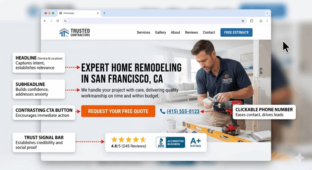
Your homepage hero section the first thing visible should contain:
- A clear headline that states what you do and where: “Expert Roofing and Construction Services in [City] Licensed, Insured, and Ready to Build.”
- A subheadline that addresses the visitor’s core concern: “Quality workmanship, on-time delivery, and a clean job site guaranteed.”
- A primary CTA button in a contrasting color: “Get a Free Estimate” or “Call Us Today”
- Your phone number in a large, clickable format
- A trust signal years in business, number of projects completed, or a star rating
This is not revolutionary design. It’s the difference between a brochure and a sales tool.
Sign #4: Your Project Photos Are Outdated, Low Quality, or Missing
Why It’s Losing You Jobs
For a construction company, project photos are the primary sales tool. They answer the question every buyer is silently asking: Can this company actually do what I need, at the quality I expect?
Outdated photos signal that the company isn’t actively working or isn’t proud of recent work. Low-quality photos (blurry, poorly lit, cluttered job sites in frame) suggest the same carelessness that a buyer fears on their project. Missing photos force the visitor to take your capabilities entirely on faith something most buyers aren’t willing to do when the purchase involves thousands of dollars.
If the most recent project photos on your website are more than 12 months old, a visitor who notices that timestamp is already less likely to call.
How to diagnose it:
Review every photo currently on your website:
- When was each photo taken? Is your portfolio current?
- Is the image quality sharp, well-lit, and professionally composed?
- Do the photos show the full range of services you offer?
- Are before-and-after sets present for at least some projects?
- Are job-site vehicles, equipment, and debris visible in the “finished” photos?
How to Fix It
Immediate actions:
- Remove any photo more than two years old that isn’t exceptional
- Take before-and-after photos at your next three job completions using the techniques covered in our guide to project photo marketing
- Compress and upload the new photos to your website gallery and to relevant service pages
Structural fix: Build a habit of photographing every completed project and updating your website gallery quarterly at minimum. If your website makes it difficult or time-consuming to add new photos, that friction is a design problem worth solving a well-built site should allow new project photos to be uploaded in minutes.
The before-and-after format: Before-and-after photo sets consistently outperform “after only” galleries in engagement and conversion. The contrast communicates transformation, demonstrates that you can handle real-world starting conditions, and creates an emotional response that a single glamour shot cannot match.
Sign #5: There’s No Social Proof
Why It’s Losing You Jobs
Social proof reviews, testimonials, star ratings, case studies is the mechanism that converts an interested visitor into a confident one.
A potential customer who found your website through Google already knows you exist. What they don’t know is whether you’re trustworthy, whether you show up on time, whether you leave the job site clean, and whether the finished product actually looks like the photos on your website.
Reviews and testimonials answer all of these questions, from the perspective of people who’ve already been through the experience. They’re the most trusted form of marketing content available and most construction websites have either none, or a handful of anonymous testimonials with no names, no dates, and no specificity that makes them feel real.
How to diagnose it:
Look at your website from a first-time visitor’s perspective:
- Are there any customer reviews or testimonials visible?
- Do they include the customer’s name, location, and the specific project completed?
- Are they recent (within the last 12–18 months)?
- Is your Google review rating and count displayed anywhere?
- Is there a link to your Google Business Profile where prospects can read full reviews?
How to Fix It
Short-term: Pull your three to five most specific, detailed Google reviews ones that mention the project type, the team’s behavior, and a specific outcome and add them as testimonials on your homepage and relevant service pages. Include the reviewer’s first name and last initial, city, and the service they received.
Add a widget or plugin that displays your live Google review rating and count (tools like Elfsight or EmbedReviews can do this automatically, pulling directly from your Google Business Profile).
Long-term: A systematic review generation process connected to your CRM ensures that every completed job produces a new review request, and that the strongest reviews continuously refresh your website’s social proof. A construction company completing 8–12 jobs per month should be generating 2–4 new reviews per month minimum and those reviews should appear on the website automatically.
Sign #6: Your Website Has No Individual Service Pages
Why It’s Losing You Jobs
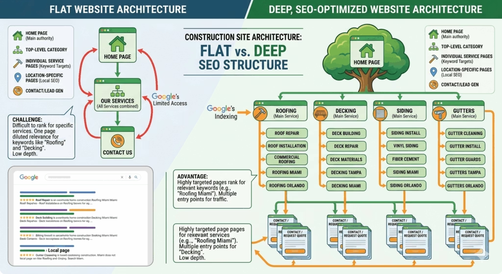
Many construction company websites have a single “Services” page that lists everything roofing, siding, gutters, decks, additions in a single block of text or a brief bulleted list.
This approach fails on two levels simultaneously.
It fails for SEO. Google cannot rank a single page competitively for multiple different service keywords. A page trying to rank for “roof replacement [city],” “deck construction [city],” and “siding installation [city]” at the same time will rank well for none of them. Search engines reward specificity a page dedicated entirely to roof replacement, with thorough content, relevant photos, and location signals, will significantly outrank a generic services page for that query.
It fails for conversion. A homeowner searching for deck builders who lands on a page that also talks about roofing, siding, and additions has to work to find the information relevant to their need. Friction in the search for information correlates directly with lower conversion rates. The visitor who searches “deck builder [city]” and lands on a page exclusively about deck construction with deck photos, deck-specific FAQs, and a CTA for deck estimates converts at a dramatically higher rate.
How to diagnose it:
Count the number of distinct service pages on your website. If all your services live on a single URL, you have this problem. If each service has its own page but those pages are thin (fewer than 500 words, few photos, no FAQs), you have a partial version of the same problem.
How to Fix It
Build a dedicated page for every distinct service you offer. At minimum, each page should include:
- A keyword-rich H1 headline specific to that service and location
- 600–1,000 words of original content about the service, written for the homeowner
- Before-and-after project photos specific to that service
- A list of what’s included in the service and what differentiates your approach
- 3–5 FAQs that address the questions buyers ask most about that service
- Trust signals (certifications, warranties, materials used)
- A clear CTA with a direct estimate request form or phone number
This is the structural change that turns a brochure website into an SEO asset. It’s also one of the primary ways a professionally designed construction company website is fundamentally different from a DIY template build the page architecture is designed from the ground up to rank and convert for each specific service.
Sign #7: There’s No Easy, Obvious Way to Contact You
Why It’s Losing You Jobs
A visitor who has navigated your website, looked at your project photos, read a testimonial, and decided they want to get an estimate that visitor is a conversion waiting to happen. They just need a frictionless path to take the next step.
If that path is unclear, hard to find, or more complicated than it needs to be, a percentage of those ready-to-convert visitors will give up and find a competitor who makes it easier.
This happens more often than most website owners realize. Common friction points:
- The phone number is only in the footer invisible to mobile users who never scroll that far
- The contact form asks for too much information name, address, email, phone, project description, preferred contact time, how they heard about you before anyone is willing to commit to providing all of it
- There’s no confirmation after form submission the visitor completes the form, the page refreshes or goes blank, and they have no idea whether it was received
- The contact page is the only place to take action there’s no CTA on the homepage, no CTA on service pages, no CTA at the end of blog posts
- There’s no call button on mobile a phone number displayed as plain text instead of a clickable link requires the mobile user to manually dial, adding a step that a surprising number of people won’t bother with
How to diagnose it:
Test your website’s contact experience right now as if you’re a first-time visitor:
- How many clicks does it take to reach the estimate form?
- Is the phone number clickable on mobile?
- How many fields does the form require before submission?
- Is the phone number visible in the header on every page?
- What happens immediately after a form is submitted?
How to Fix It
Phone number: Display it in the header on every page, in a large font, formatted as a click-to-call link on mobile. If you want to track which marketing channels generate calls, use a unique tracking number per channel.
Estimate form: Reduce to the minimum required fields. Name, phone number, email, and a brief description of the project is enough to generate a meaningful lead. You can gather additional detail when you call back. Every additional field reduces form completion rates.
CTA placement: Add a CTA either a button or a short form to:
- The homepage, above the fold
- The bottom of every service page
- The end of every blog post
- The header or sticky bar on mobile
Immediate response: Set up an auto-responder that confirms every form submission instantly. “Thanks for reaching out we’ll be in touch within one business hour” reduces abandonment and sets a professional expectation. Connecting your form to a CRM and automated follow-up system takes this further every submission triggers an immediate automated response and a follow-up sequence, ensuring no inquiry is ever left unanswered regardless of when it comes in.
How Many of These Signs Apply to Your Website?
Take a moment to score your current website honestly.
For each sign, mark whether it applies to your site:
- Sign 1: Pages load in more than 3 seconds on mobile
- Sign 2: The site isn’t fully usable on a smartphone
- Sign 3: No clear headline, CTA, or phone number visible without scrolling
- Sign 4: Project photos are outdated, low quality, or missing
- Sign 5: No reviews, testimonials, or star ratings visible on the site
- Sign 6: All services live on a single page rather than individual service pages
- Sign 7: The contact experience is unclear, hidden, or requires too many steps
0–1 boxes checked: Your website is in solid shape. Focus on ongoing content and conversion rate optimization.
2–3 boxes checked: Your website has specific, fixable problems. Prioritize the ones tied to conversion (Signs 3, 5, and 7) first they typically produce the fastest revenue impact.
4–5 boxes checked: Your website has compounding problems that are likely costing you multiple leads per week. A targeted redesign of the highest-impact pages (homepage and top service pages) is probably worth the investment.
6–7 boxes checked: Your website is actively working against your marketing. Every dollar you spend driving traffic to it is partially wasted. A full website rebuild, built to convert, is likely the highest-ROI investment available to your business right now.
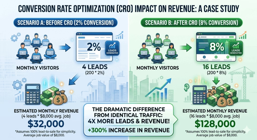
The Multiplier Effect of a High-Converting Website
Here’s the perspective that reframes website investment from a cost to a business decision:
Every marketing channel you use Google Ads, SEO, Facebook, referrals, Google Business Profile sends traffic somewhere. If that somewhere is a website that converts at 2%, you’re extracting minimal value from every lead source.
If that same traffic hits a website that converts at 8% through faster load times, clear CTAs, strong social proof, and dedicated service pages you’ve quadrupled your lead volume from the same marketing spend.
A $5,000–$10,000 investment in a properly built construction company website, if it moves your conversion rate from 2% to 6%, generates the equivalent of tripling your marketing budget with no additional spend. And unlike ad spend, that improvement compounds indefinitely.
This is why a professionally designed, conversion-focused website is the cornerstone of every marketing strategy built for construction and roofing companies because without it, every other tactic is working at a fraction of its potential.
Your 30-Day Website Improvement Plan
You don’t have to fix everything at once. Here’s a prioritized 30-day action plan based on impact-to-effort ratio:
Week 1 — Quick Wins (No Developer Required)
- Compress and replace the three largest images on your homepage
- Make your phone number clickable on mobile (change it from plain text to a
tel:link) - Add one real customer testimonial with full name and project type to your homepage
- Run PageSpeed Insights and implement the top two “Easy Fix” recommendations
Week 2 — Content Improvements
- Rewrite your homepage headline to clearly state your service type and location
- Add a prominent “Get a Free Estimate” button above the fold
- Pull your best five Google reviews and embed them on your homepage
- Update your project gallery with your three most recent completed jobs
Week 3 — Structural Fixes
- Identify your two highest-revenue services and build or improve dedicated pages for each
- Add a CTA form or button to the bottom of each service page
- Simplify your contact form to five fields maximum
Week 4 — System Connections
- Connect your website contact form to a CRM or at minimum an email notification system
- Set up a form confirmation auto-responder
- Submit your site to Google Search Console and check for any crawl or mobile usability errors
These four weeks won’t produce a perfect website. But they will produce a meaningfully better one one that converts more of the traffic you’re already generating before you spend another dollar on advertising.
The Bottom Line
A construction company website that looks fine on the surface can be losing multiple qualified leads every single week through problems that are invisible until you know where to look.
Slow load times, poor mobile experience, unclear CTAs, missing social proof, thin service pages, and buried contact options each of these is a quiet tax on every marketing dollar you spend. Fix them, and those same dollars produce more leads, more booked jobs, and more revenue without any increase in spend.
The work you do every day is good. Your website should say the same.
Recent Post
Google Business Profile vs. Google Ads: Which One Should a Contractor Invest in First?
How Much Should a Roofing or Construction Company Spend on Marketing? (A No-BS Breakdown)
The Before-and-After Effect: Why Project Photos Are Your Best Marketing Asset as a Builder
Roofing Leads vs. Roofing Customers: Why Most Contractors Are Targeting the Wrong Thing
How to Set Up a Follow-Up System That Books More Jobs Without Hiring Another Employee
Categories
You Might Also Like
Explore additional articles based on your interests.
View All
Pudgy Squirrel Marketing
7 Signs Your Construction Company’s Website Is Losing You Jobs (And How to Fix It)
Read More
Pudgy Squirrel Marketing
Google Business Profile vs. Google Ads: Which One Should a Contractor Invest in First?
Read More
Pudgy Squirrel Marketing
How Much Should a Roofing or Construction Company Spend on Marketing? (A No-BS Breakdown)
Read More
Pudgy Squirrel Marketing
The Before-and-After Effect: Why Project Photos Are Your Best Marketing Asset as a Builder
Read More
Pudgy Squirrel Marketing
Roofing Leads vs. Roofing Customers: Why Most Contractors Are Targeting the Wrong Thing
Read More
Pudgy Squirrel Marketing
How to Set Up a Follow-Up System That Books More Jobs Without Hiring Another Employee
Read More
Pudgy Squirrel Marketing
What to Post on Facebook When You’re a Contractor (And Have No Time to Think About It)
Read More
Pudgy Squirrel Marketing
Shed Business Marketing 101: How to Sell More Sheds Without Relying on Lot Traffic
Read More