
Get In Touch
Pudgy Squirrel Marketing
The Anatomy of a High-Converting Contractor Website: What Customers Actually Look for Before Calling
By Tony
July 24, 2026
15 mins
Share:
Key Takeaways
- A contractor website that converts well isn’t about good design for its own sake. It’s about engineering a specific sequence of trust signals that answer the buyer’s silent questions in the right order.
- Homeowners arrive at a contractor website with a checklist running in the back of their minds capability, credibility, local relevance, and ease of contact. Every element of your website either checks those boxes or creates doubt.
- The anatomy of a high-converting contractor website follows a predictable structure: it earns trust above the fold, deepens it through social proof and project evidence, answers the questions buyers have before they ask them, and makes the next step frictionless.
- Most contractor websites fail not because they look bad, but because they’re structured around what the contractor wants to say rather than what the buyer needs to know.
- Small structural changes headline rewrites, CTA placement, photo format, testimonial placement can move a website’s conversion rate from 2% to 6–8% without a full redesign.
- A website that converts at 6% sends three times as many leads to your phone and inbox as one that converts at 2%, from the exact same traffic. It’s the highest-leverage improvement in contractor marketing.
What’s Actually Happening in a Buyer’s Head
Before a homeowner picks up the phone or fills out your estimate form, they’ve run through an unconscious but predictable mental checklist.
It doesn’t matter whether they found you through Google, a referral, a Facebook post, or a yard sign. The moment they land on your website, the same questions are running:
Can this company do what I need done? Do they do work that looks like what I want? Have they done it in my neighborhood or for people like me? Are they legitimate licensed, insured, established? What will it be like to work with them? Do they respond quickly? Is this going to be a headache or a good experience?
These questions are not asked consciously. They’re evaluated through a stream of signals absorbed in seconds your headline, your photos, your reviews, your phone number placement, the visual quality of the page, whether the logo looks professional, whether the testimonials feel real.
A high-converting contractor website doesn’t just answer these questions somewhere on the page. It answers them in the right order, at the right visual weight, in the first 30–60 seconds of the visitor’s experience.
This post breaks down exactly how to do that section by section, element by element so you understand not just what to include but why each piece earns the conversion.
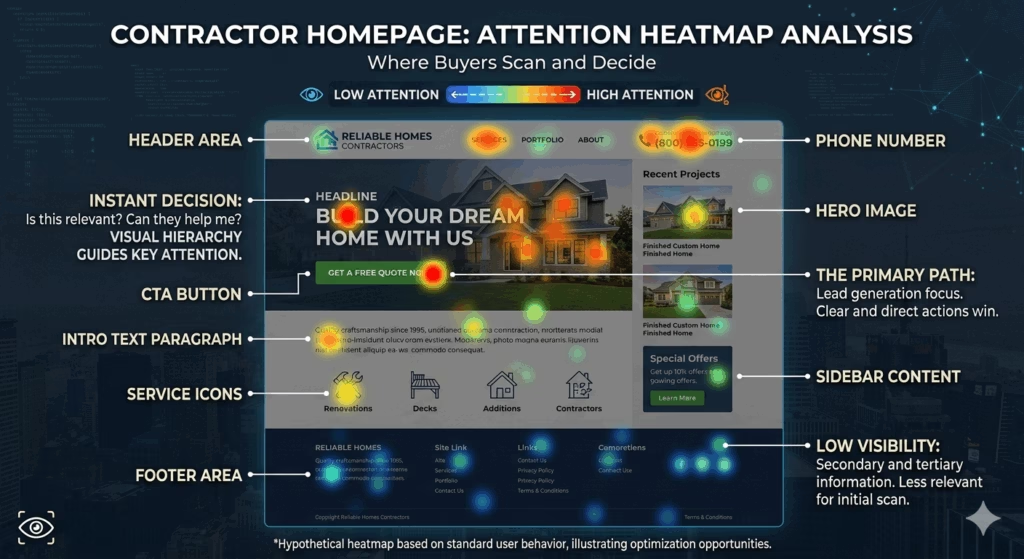
Section 1: The Header Your First Three Seconds
The header is the strip at the top of every page. Most contractor headers contain a logo and a navigation menu. High-converting contractor headers contain much more.
What the Header Must Communicate
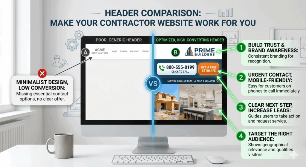
Your logo and business name: This seems obvious, but many contractor websites use a logo that’s too small, too detailed, or too similar to competitors’ branding to register as distinct. Your logo should be large enough to read on mobile at a glance.
Your primary phone number: This is the element most contractor headers are missing, or have in a font too small to read comfortably on a phone. The header phone number should:
- Be displayed in a font size of at least 18px, larger on desktop
- Be formatted as a click-to-call link on mobile (the
tel:HTML attribute) - Appear on every single page of the website not just the homepage or contact page
- Be the first number the eye encounters when scanning the top of the page
Your primary call-to-action: A “Get a Free Estimate” or “Book Now” button in a contrasting color not the same color as your header background. This button should appear in the header on every page, not buried in the body content.
Your service area signal: A short phrase or visual element that immediately communicates the geographic area you serve. “Serving Wichita and Surrounding Areas” or “Kansas City’s Trusted Roofing Contractor.” This does two things: it tells the visitor they’re in the right place, and it reinforces local relevance signals for SEO.
What the Header Must Not Do
- Use a navigation menu with eight or more items at the same visual weight. Navigation should guide, not overwhelm.
- Rely on a hamburger menu on desktop. Hamburger menus (three horizontal lines) are appropriate on mobile but hide navigation on desktop where buyers expect to see it.
- Display only a logo with no contact information. A logo with no phone number or CTA leaves the visitor with no obvious next step.
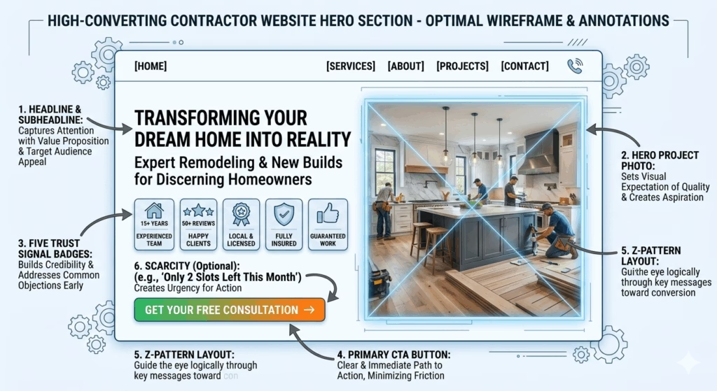
Section 2: The Hero The Next Seven Seconds
The hero section is the large visual area below the header and above the first scroll point everything visible before the visitor touches the scroll wheel. It is the most important real estate on your website.
Most contractor heroes contain a stock photo and a generic tagline. High-converting contractor heroes are built with intention across every element.
The Hero Headline
Your headline is the single most important piece of copy on your website. It determines whether a visitor who’s scanning decides to keep reading.
The two most common contractor headline mistakes:
Too generic: “Quality You Can Trust” | “Your Local Experts” | “Building Dreams Since 2005”
These phrases appear on thousands of contractor websites. They say nothing specific, create no differentiation, and answer none of the buyer’s mental checklist questions.
Too service-focused: “Residential and Commercial Roofing Services” | “Custom Sheds and Storage Buildings”
Better than generic at least it tells the visitor what you do but it still doesn’t address the buyer’s core concern or create any emotional engagement.
What a high-converting headline actually says:
It addresses the buyer’s specific situation, communicates your core differentiation, or speaks to the outcome they want in plain, specific language.
Examples:
- “Roof Replacement in [City] Done Right — Guaranteed, On Time, and Fully Insured”
- “Wichita’s Most Reviewed Shed Dealer — Custom Storage Buildings Built to Last 30+ Years”
- “Trusted Deck Builders Serving [City] — Clean Job Sites, On-Time Delivery, and Lifetime Workmanship Warranty”
Each of these answers at least three of the buyer’s silent questions in a single sentence: capability (what you do), location (where you do it), and credibility (why they should trust you).
The Hero Subheadline
The subheadline adds one layer of supporting context. It addresses the buyer’s secondary concern or elaborates on a key differentiator that didn’t fit in the headline.
“We’ve completed over 800 roof replacements across [County] with an average Google rating of 4.9 stars. No subcontractors. No surprises on the final invoice.”
This subheadline answers: Do they have experience? Are they local? Are there hidden costs?
The Hero Image
A professional photo of a completed project specifically, a photo of the type of project the visitor is likely looking for is the optimal hero image for a contractor website.
Not a stock photo of a smiling handshake. Not a generic “hard worker” image. An actual completed job, photographed well, that shows what your work looks like at its best.
The hero image is the first visual proof of capability the visitor receives. Make it count.
Hero Trust Signals
Below the headline and subheadline, a strip of three to five trust signals reinforces the message with specificity:
- ✓ Licensed & Insured in [State]
- ✓ [X]+ Years in Business
- ✓ [X]+ Projects Completed
- ✓ [X]-Star Google Rating ([X]+ Reviews)
- ✓ Free Estimates No Obligation
These signals are scannable, credible, and directly address the questions buyers have before they feel comfortable proceeding.
The Primary CTA
A large, high-contrast button “Get My Free Estimate” or “Call Us Now: [Phone Number]” sits directly below or beside the trust signals. This is the conversion point for visitors who are already sold by what they’ve read above the fold.
Not every visitor will click this on the first screen. Many will scroll to see more. But for the percentage who arrive with high intent and see exactly what they need capability, credibility, location, easy next step the button is there and obvious.
Section 3: Social Proof The Trust Builder That Does the Heavy Lifting
After the hero, most buyer journeys don’t go straight to the contact form. They scroll. They look for more evidence. They’re asking: Are other people actually happy with this company?
This is where social proof reviews, testimonials, star ratings, review counts does the heaviest lifting on your entire website.
Why Social Proof Works So Powerfully for Contractors
The stakes of hiring a contractor are high. A bad experience costs thousands of dollars to fix and months of frustration. Buyers are risk-averse.
Social proof from other buyers who took the same risk and had a good outcome is the most powerful form of reassurance available. It answers the trust question in a way that no amount of self-promotion ever can.
What High-Converting Contractor Social Proof Looks Like
Not this:
- “We pride ourselves on quality workmanship” (the company said this about itself)
- An anonymous quote: “Great work highly recommend!” (no name, no date, no specificity)
This: A review with a full name, a city reference, a specific project mentioned, and a detail that shows the experience was real:
“John and his crew replaced our entire roof after the June hailstorm. They kept us updated every day, cleaned up completely each evening, and the finished product looks incredible. Three months later, no issues. We’d hire them again without hesitation.” Sarah M., Overland Park, KS
That review answers: Do they communicate well? Do they leave a mess? Does the work hold up? Are they experienced with storm damage? The specificity is what makes it credible and persuasive.
Where to Place Social Proof
- On the homepage: Three to five of your strongest testimonials, directly below the hero section. These are the first thing the scrolling visitor encounters after the opening impression.
- On every service page: Testimonials specific to that service. A visitor on your deck-building page wants to see testimonials from deck customers.
- Near every CTA: A review or star rating next to a “Get a Free Estimate” button reduces the hesitation that often prevents the click.
- In a dedicated reviews section: A page or section that displays your Google review rating, review count, and a curated selection of detailed testimonials from real customers.
Displaying Your Google Star Rating
Your live Google star rating and review count should be visible on your website ideally embedded so it updates automatically as new reviews arrive. Tools like Elfsight or a native Google review widget can display this dynamically.
A visual badge showing “4.8 Stars 127 Google Reviews” communicates scale and credibility in a single element that no written claim can replicate.
Section 4: The Project Gallery Visual Proof of Capability
After social proof establishes that others trust you, the project gallery answers the buyer’s capability question with their own eyes.
The Gallery’s Conversion Function
A visitor who is looking at your project gallery is doing something specific: they’re mentally casting you in the role of completing their project. They’re picturing their roof, their backyard, their property and using your work as a reference for what they can expect.
This visualization process is the deepest form of buyer engagement available on a contractor website. It’s the moment the abstract possibility of hiring you becomes a concrete mental image of working with you.
What a High-Converting Gallery Contains
Before-and-after sets: Not just after photos. The before photo establishes that you’ve handled similar starting conditions. The contrast between before and after creates an emotional response the aspiration to have their own transformation that a single finished photo cannot.
Variety of project types and scales: Buyers want to see that you’ve done work similar in type and scope to their project. A homeowner with a 1,500 square foot ranch roof doesn’t need to see only large commercial projects. Show the range.
Real photos not stock: No contractor stock photo library. Every image should be from an actual project your company completed. If a buyer reverse-image searches a stock photo and finds it on seven other contractor websites, the damage to your credibility is significant.
Geographic labels where possible: “Project in Lenexa, KS” or “Completed in Wichita’s Riverside neighborhood” adds local relevance that resonates with buyers in those areas and improves geo-specific SEO signals.
Detail shots alongside wide shots: Wide establishing shots show scope. Close-up detail shots show craftsmanship. Buyers who are evaluating quality will study both. Don’t publish only wide shots.
Gallery Organization
Organize your gallery by project type not by date or in an undifferentiated scroll. A visitor looking for shed projects shouldn’t have to hunt through roofing photos to find them. Organized galleries by service type also allow Google to understand the content of each gallery section more precisely, improving image search visibility.
Section 5: Service Pages Where SEO Meets Conversion
Many contractor websites have a single “Services” page. High-converting contractor websites have individual pages for each service and those pages each function as their own conversion experience.
Why Individual Service Pages Convert Better
When a buyer searches “deck builder [city]” and lands on a page that’s specifically and exclusively about your deck building services with deck photos, deck testimonials, deck-specific FAQs, and a deck estimate CTA the relevance match between their intent and the page they landed on is perfect.
This relevance match is measurably more persuasive than landing on a generic services page and having to scroll to find the relevant section. Every extra step between the visitor’s intent and the specific information they need reduces conversion probability.
What Each Service Page Must Include
An intent-matched headline: “Custom Deck Construction in [City] Designed to Last, Built on Time”
A thorough service description: 500–900 words that explains the service, your process, the materials you use, what differentiates your approach, and what the buyer can expect from start to finish. Written for the homeowner first, with natural keyword integration.
Service-specific project photos: Only photos of that service type on that service’s page. Don’t populate a deck page with roofing photos.
Service-specific testimonials: Pull the two or three most relevant reviews from customers who had that specific service completed.
A clear FAQ section: 4–6 questions that buyers of that specific service ask most frequently. These answer pre-call objections, reduce friction, and capture long-tail keyword traffic from search queries phrased as questions.
A prominent CTA: An estimate request form or phone number directly on the service page not requiring a separate click to the contact page.
This is one of the most significant structural differences between a contractor website built to rank and convert versus one built as a brochure and it’s why professional web design for construction and roofing companies builds individual service page architecture from the ground up rather than treating all services as a single page.
Section 6: The About Page Where the Human Connection Is Built
Many contractors treat the About page as an afterthought. It’s actually one of the most visited pages on any service business website because buyers aren’t just evaluating capability, they’re evaluating people.
Home improvement and construction are high-trust purchases. Buyers are letting strangers into their home, trusting them with their largest asset, and hoping for an experience that isn’t frustrating or contentious. The About page is where they decide whether the humans behind the business seem like people they’d want to work with.
What a High-Converting About Page Contains
Origin story: How and why the business started. Not a corporate bio a real story. “I started [Company] in 2008 after 12 years working for a regional roofing firm where I was frustrated by the gap between what was promised to customers and what was delivered. I wanted to build a company where the standard wasn’t just ‘good enough.'”
This story doesn’t have to be dramatic. It has to be human and genuine.
Faces: Photos of you, your crew, and your office (if applicable). A construction company with no human faces on its About page feels anonymous in a way that creates vague distrust. People buy from people. Show yours.
Values and operating philosophy: What do you genuinely believe about how contracting should be done? “We treat every property like it’s our own” is generic. “We don’t mark a job complete until the site is cleaner than when we arrived, because we know the neighbors are watching too” is specific, believable, and differentiating.
Credentials and certifications: Licensing, insurance, manufacturer certifications (GAF Master Elite, CertainTeed ShingleMaster, etc.), better business bureau membership, industry associations. List them with explanations for why they matter to the buyer.
Community connection: Local involvement sponsorships, volunteer work, community organizations — reinforces that you’re a legitimate, established business rooted in the same community as your buyer.
Section 7: The Contact Experience Making the Final Step Frictionless
Everything that came before brings the buyer to this moment. The contact experience is where the conversion either happens or falls apart.
The Frictionless Contact Formula
Multiple contact methods: Some buyers want to call. Some want to fill out a form. Some want to send an email. Some want to use a chat widget. The more methods you offer visibly, on the same page the more conversions you capture from the range of buyer preferences.
A short, focused estimate form: Ask only what you need to generate a meaningful lead. Name, phone number, email address, service needed, and a brief description of the project. Five to six fields maximum.
Every additional field reduces form completion rates. You can gather the remaining details when you make the follow-up call and that call is where you build the relationship that closes the sale.
An immediate confirmation: When the form is submitted, the visitor should see a clear confirmation message: “We received your request you’ll hear from us within [timeframe].” The absence of any confirmation creates uncertainty that can make buyers wonder whether their submission registered and prompt them to call a competitor.
Strategic CTA placement across the entire site: A contact CTA should appear:
- In the header on every page
- At the bottom of every service page
- At the end of the homepage
- In a sticky bar on mobile (a bar pinned to the bottom of the screen with a call button)
- At the end of every blog post
Don’t wait for buyers to navigate to the contact page. Meet them where they already are with a path to the next step.
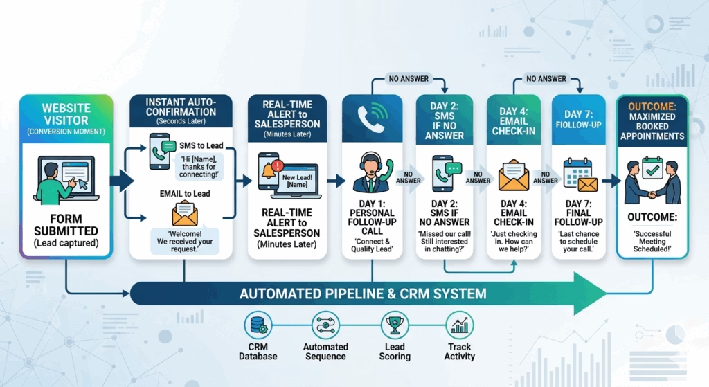
The Follow-Up System Connected to Your Contact Form
A high-converting website captures the lead. What happens next determines whether that lead becomes a customer.
A contact form submission that sits in an email inbox for four hours while the buyer also submitted to two other contractors is a lead that the fastest responder wins. Most of the time, that means someone else.
Connecting your contact form directly to a CRM and automated follow-up system turns a form submission into an immediate automated response, a real-time sales alert, and a multi-touch follow-up sequence all without anyone manually monitoring the inbox. The lead is captured, confirmed, and followed up on whether you’re on the roof or in a meeting.
This is the link between your website’s conversion rate and your pipeline’s close rate. Both matter. Optimizing only one leaves money on the table.
Section 8: Speed, Mobile, and Technical Foundation
All of the above the compelling headline, the powerful social proof, the project gallery, the service pages is worthless if the site loads slowly or doesn’t display properly on a phone.
These technical factors are prerequisites, not optional enhancements.
Mobile Optimization Is Not Optional
More than 60% of local contractor searches happen on smartphones. A website that’s beautiful on a desktop and frustrating on a phone is functionally rejecting more than half of its potential customers before they see a single trust signal.
Mobile optimization means:
- Text readable without zooming (minimum 16px body font)
- Buttons and links large enough to tap accurately (minimum 44×44px touch targets)
- Phone number that triggers a direct call with one tap
- Forms completable with a phone keyboard in under two minutes
- Images that scale correctly to any screen size
- No horizontal scrolling required
Page Speed Is a Conversion Factor
Google’s research consistently shows that mobile users abandon websites loading longer than three seconds at rates above 50%. Every additional second of load time measurably reduces conversion rate.
Compress all images before uploading (target under 200KB per image). Use quality hosting that isn’t shared with thousands of other sites. Remove third-party scripts, chat widgets, and social media feeds that aren’t essential.
Run your site through PageSpeed Insights monthly and address any issues flagged in the “High Opportunity” category.
SSL Certificate (HTTPS)
A website without a valid SSL certificate displays a “Not Secure” warning in most browsers. This warning is a conversion-killer for a construction or contracting website, where trust is the primary purchase criterion. Ensure your SSL certificate is current and renews automatically.
The Conversion Rate Math: Why This All Matters
Understanding why these elements matter requires understanding what the conversion rate difference between a mediocre and a well-built website actually means in revenue terms.
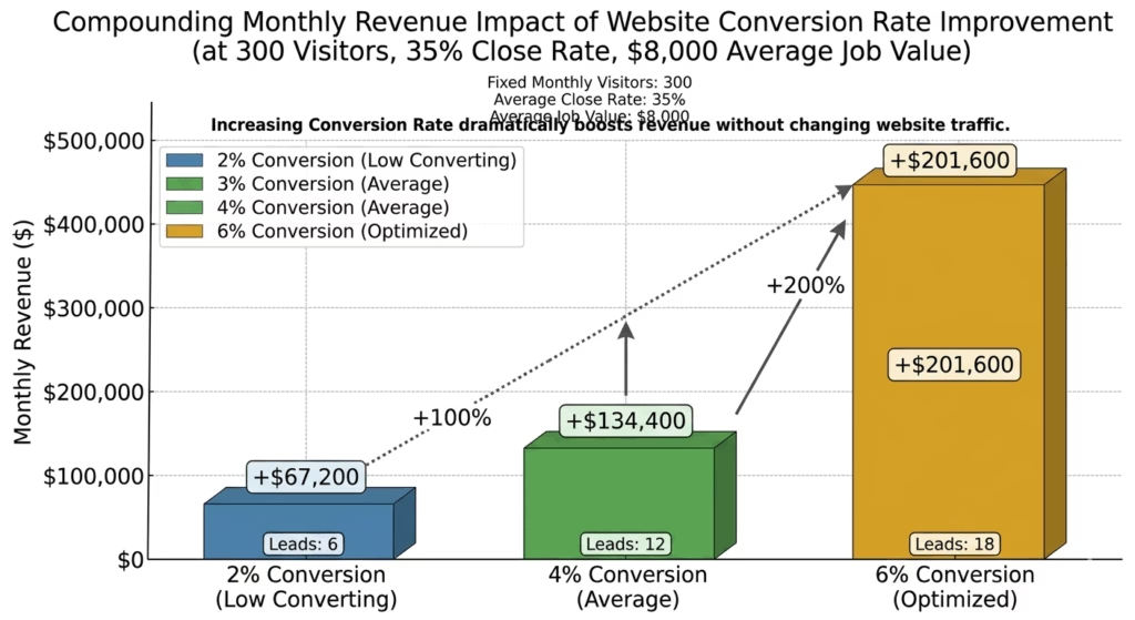
Suppose your website receives 300 visitors per month.
At 2% conversion rate: 6 leads/month. At a 35% close rate and $8,000 average job value: 2.1 booked jobs/month = ~$16,800 in monthly revenue from website leads.
At 6% conversion rate: 18 leads/month. Same close rate, same average job value: 6.3 booked jobs/month = ~$50,400 in monthly revenue from website leads.
Same 300 visitors. Same ad spend to generate that traffic. The only difference is how the website handles those visitors once they arrive.
The difference between a 2% and a 6% converting website achievable through the structural and content changes described in this post is $33,600 per month in additional revenue from identical traffic.
That is the real value of a high-converting contractor website. Not the aesthetics. Not the branding. The revenue produced per visitor who finds you.
A professionally built, conversion-optimized website for roofing and construction companies is not a cost center. At these numbers, it’s one of the highest-ROI investments in the business.
The Contractor Website Anatomy: A Quick-Reference Summary
For everything above, here’s the complete page-by-page structure of a high-converting contractor website:
Homepage:
- Header: Logo + phone number (click-to-call) + CTA button + service area identifier
- Hero: Specific headline + supporting subheadline + project photo + trust signals + primary CTA
- Social proof block: 3–5 testimonials + Google star rating badge + review count
- Services overview: Brief descriptions with images linking to individual service pages
- Project gallery preview: 6–9 best before-and-after sets with “View Full Gallery” link
- Secondary CTA: Estimate form or call prompt
- About preview: Brief company story with team photo linking to About page
- Footer: Contact info, service area, nav links, license/insurance badges
Individual Service Pages (one per service):
- Intent-matched headline
- Service description (500–900 words)
- Service-specific project photos
- Service-specific testimonials
- FAQ section (4–6 questions)
- CTA (form or phone)
About Page:
- Origin story
- Team photos
- Values and philosophy
- Credentials and certifications
- Community connection
Contact Page:
- Multiple contact methods
- Short form (5–6 fields)
- Confirmation messaging
- Map embed and address
- Business hours
Project Gallery:
- Organized by project type
- Before-and-after sets
- Location labels
- High-quality images compressed for fast loading
The Bottom Line
Homeowners arrive at your website with a checklist. They’re evaluating capability, credibility, local relevance, and ease of contact in that order, in seconds, mostly unconsciously.
A high-converting contractor website is built to check those boxes in the right order, through the right signals, with enough specificity and authenticity that doubt dissolves before the buyer ever reaches the contact form.
The anatomy described in this post isn’t a template. It’s a framework built on how buyers actually make decisions and every element has a reason rooted in buyer psychology, not design preference.
Audit your website against this anatomy. Identify the gaps. Prioritize the highest-impact fixes. And remember the conversion rate math: a website that converts at 6% sends three times as many leads to your phone as one that converts at 2%, from the exact same traffic.
The visitors are already there. The question is whether your website is built to capture them.
Why Schedule a Call?
Popular Insights
What a Roofing Website Should Cost in 2026 (And What You Actually Get for the Money)
Sep. 04, 2026
Spring Marketing Surge: How Roofing and Construction Companies Should Prepare Their Ads Before Peak Season
Aug. 28, 2026
The Shed Dealer’s Digital Playbook: How to Get Found Online and Fill Your Lot
Aug. 21, 2026
The Shed Business Owner’s Blueprint for Getting Found on Google
Aug. 14, 2026
Why Your Roofing Website Gets Traffic But No Phone Calls (And How to Fix It)
Aug. 07, 2026Topics
Pudgy Squirrel Marketing
What a Roofing Website Should Cost in 2026 (And What You Actually Get for the Money)
Read More
Pudgy Squirrel Marketing
Spring Marketing Surge: How Roofing and Construction Companies Should Prepare Their Ads Before Peak Season
Read More
Pudgy Squirrel Marketing
The Shed Dealer’s Digital Playbook: How to Get Found Online and Fill Your Lot
Read More
Pudgy Squirrel Marketing
The Shed Business Owner’s Blueprint for Getting Found on Google
Read More
Pudgy Squirrel Marketing
Why Your Roofing Website Gets Traffic But No Phone Calls (And How to Fix It)
Read More

Pudgy Squirrel Marketing
How to Use Video to Book More Jobs as a Roofer or Builder (Even If You Hate Being on Camera)
Read More
Pudgy Squirrel Marketing
The Anatomy of a High-Converting Contractor Website: What Customers Actually Look for Before Calling
Read More

Pudgy Squirrel Marketing
Seasonal Marketing: How Smart Contractors Stay Busy in the Slow Season
Read More